Maharat.ma: A Case Study in Building a Vibrant Educational Brand
Published Date: December 3, 2021

This case study details a brand strategy project I worked on back in 2021 for Maharat.ma, a dynamic training center located in Rabat, Morocco. My role was to craft a brand identity that resonated with their mission of nurturing young minds from primary to high school.
The Power of a Name
Choosing the name Maharat – Arabic for skills – was a strategic decision. It's a potent and unforgettable word that immediately conveys the center's core focus on developing a broad range of capabilities. The ".ma" domain name proudly highlights their Moroccan heritage, creating a local connection that's essential for community appeal and online visibility.
Colors with a Purpose

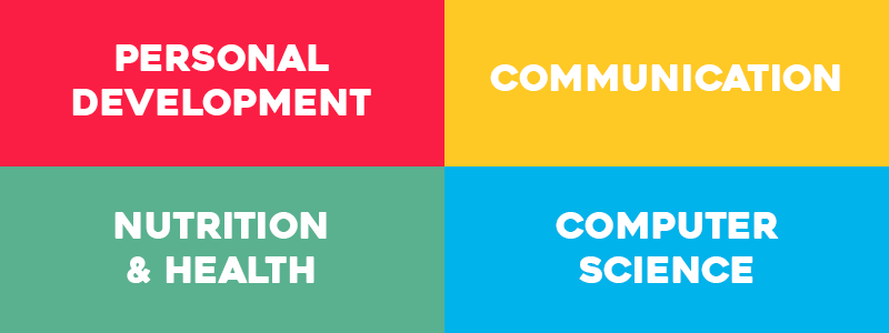
The visual identity went beyond aesthetics. Each color in the four-triangle logo represents a specific training domain, reflecting the center's multifaceted approach. These simple yet stable shapes symbolize growth, stability, and upward mobility, mirroring the aspirations of both students and Maharat.ma.
Wordmark and Font

Maharat's wordmark is a study in contrasts that perfectly reflects its mission. The bold, geometric typeface, Heavitas, underscores the center's commitment to a modern, impactful educational experience. Balanced by the subtlety of the ".ma" domain, it signifies pride in Moroccan heritage while embracing a forward-looking approach.
Symbolism of the Triangles

The logo's upward-pointing triangles are a powerful symbol of growth and achievement, a visual testament to Maharat.ma's dedication to student progress. The triangles' stability and structure represent the strong foundation of knowledge the center provides, fostering both personal and academic development.
A Logo that Speaks Volumes

The logo is a powerful symbol. Upward-pointing triangles represent growth and achievement, a visual pledge to student progress. The bold, geometric Heavitas font underscores Maharat.ma's commitment to a modern and impactful educational experience. The ".ma" adds a subtle touch of Moroccan heritage.
Reaching the Right Audience
A deep understanding of the target audience was essential for crafting a tailored brand strategy. The strategy embraced a friendly and colorful design to appeal to younger audiences, while the clear, confident Heavitas font conveys professionalism to engage parents. This dual approach facilitated connections with local schools, both private and public, positioning Maharat.ma as a valuable partner in the community's educational landscape.
I'm immensely grateful to have played a role in this transformative journey. I'm inspired to continue crafting meaningful brands that fuel progress and leave a lasting impact. If you're looking to build a brand that resonates, let's connect! Contact me to discuss your project.